Stellarvita Brand & Packaging
I developed the Stellarvita brand from the ground up, translating the product concept and messaging into a complete visual identity system. The work included logo design, color palette, typography, packaging, and the overall brand language.
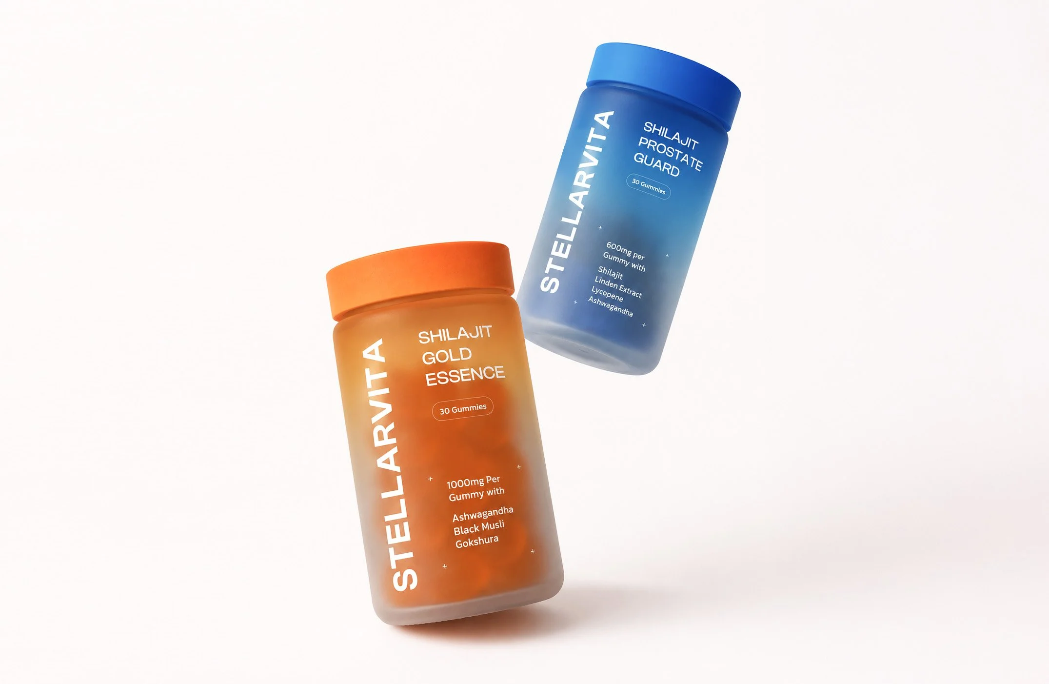
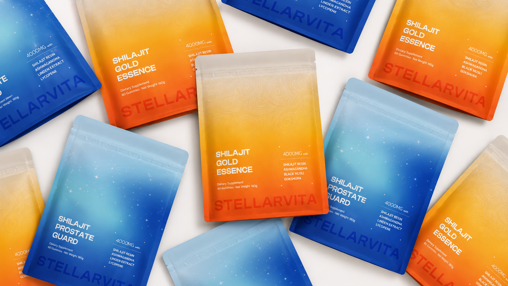
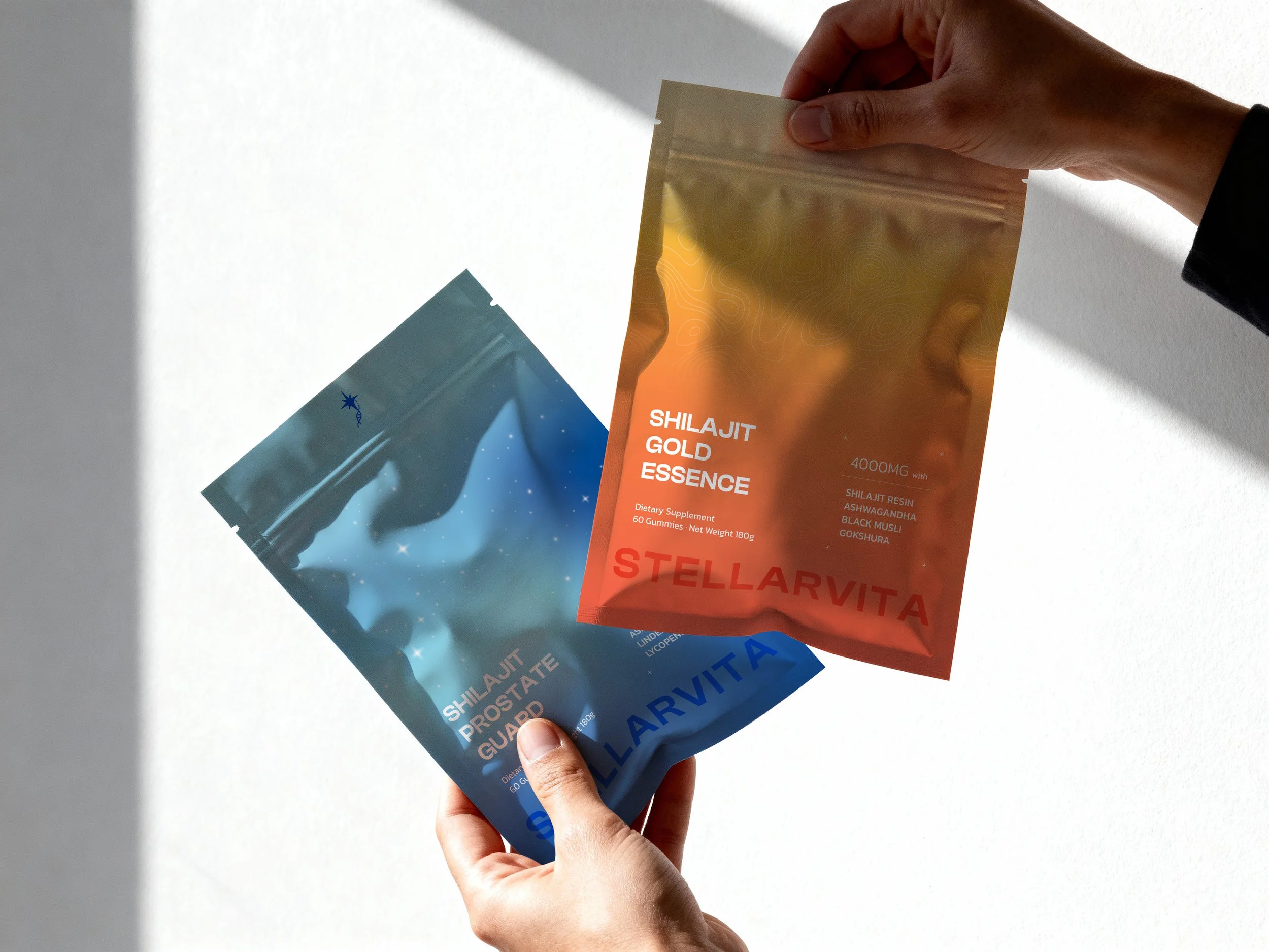
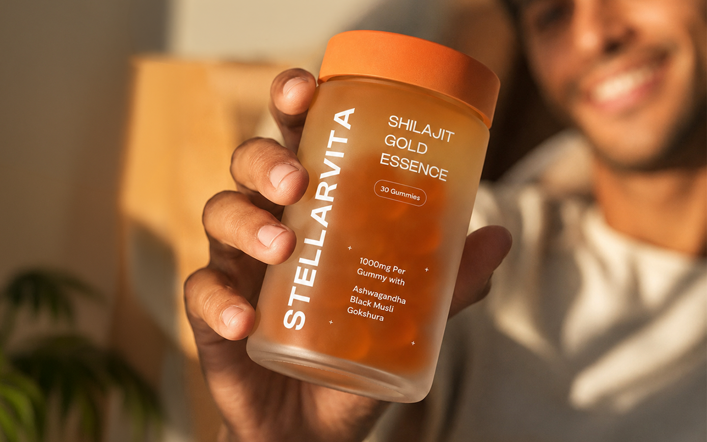
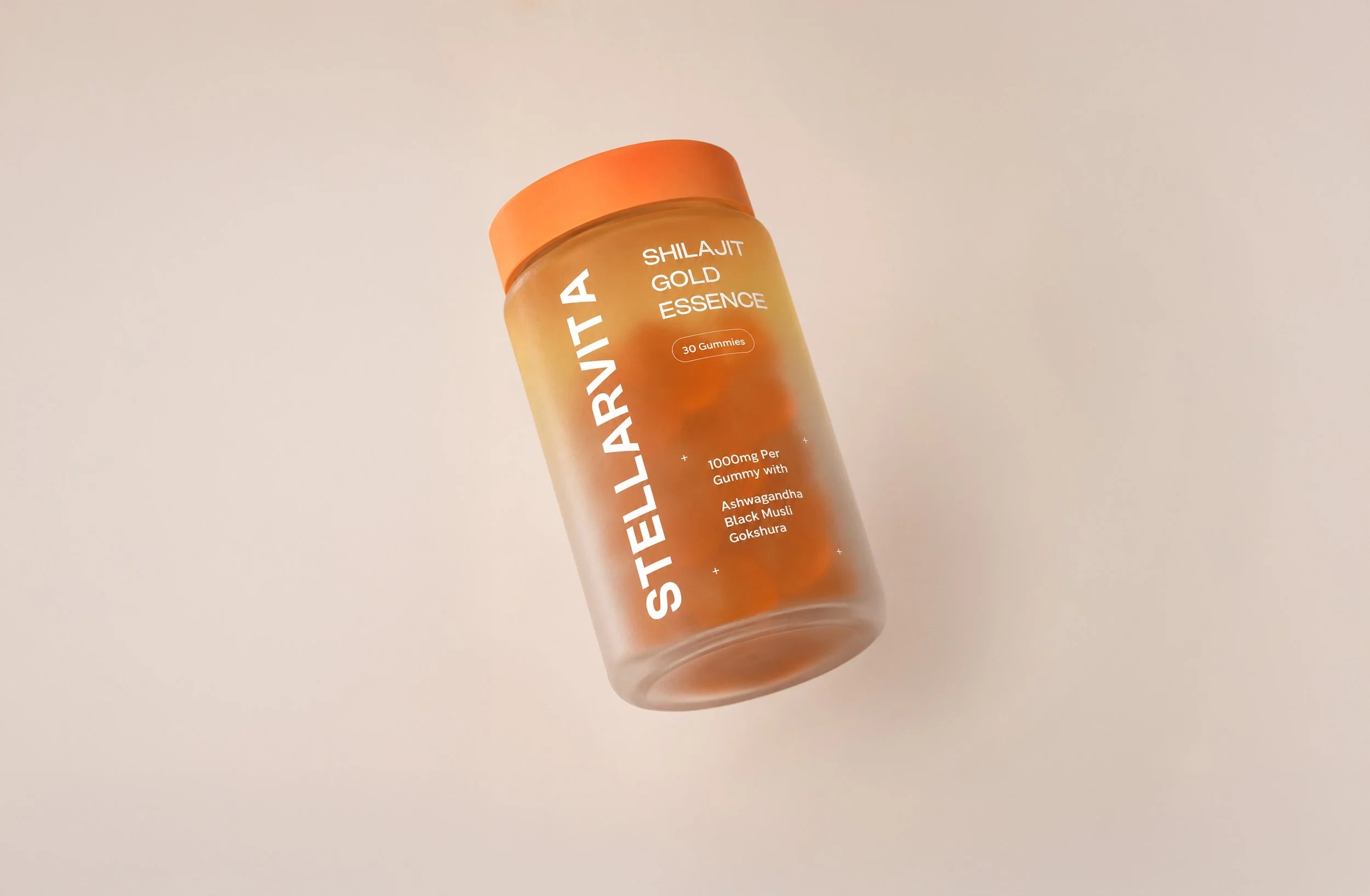
Stellarvita is a functional gummy vitamin brand focused on men’s health. The brand concept combines inspiration from space and the Himalayas to represent both technology and natural ingredients. The visual system blends a modern, science-driven look with natural elements, helping position the product as both innovative and nature-based.
Industry: Health & Wellness
Category: Brand Identity / Packaging
What I Did: Brand Identity, Logo Design, Packaging Design, Visual System, Art Direction
Stellarvita
The logo merges a human cell with a star, a symbol of Stellarvita's core belief: that energy and vitality begin at the cellular level.
The logotype is built for trust. A bold typeface with soft square letterforms strikes a balance between strength and approachability. Keeping the brand clean, modern, and confident.
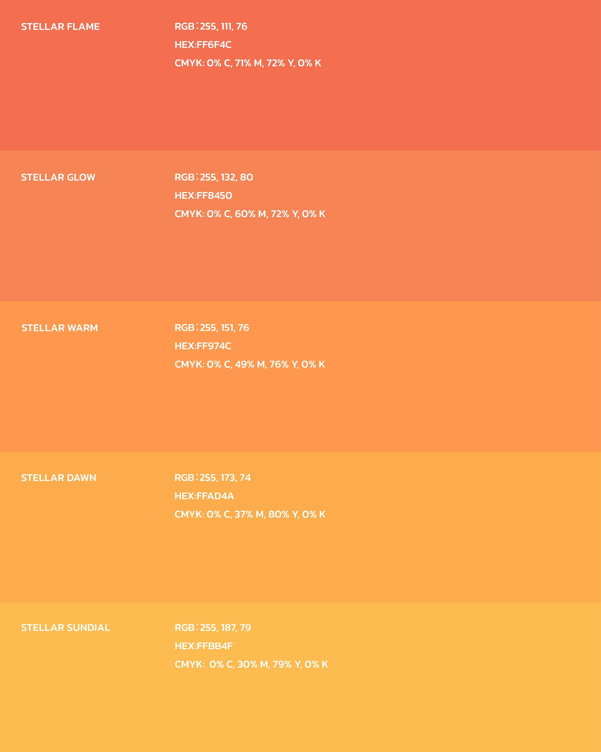
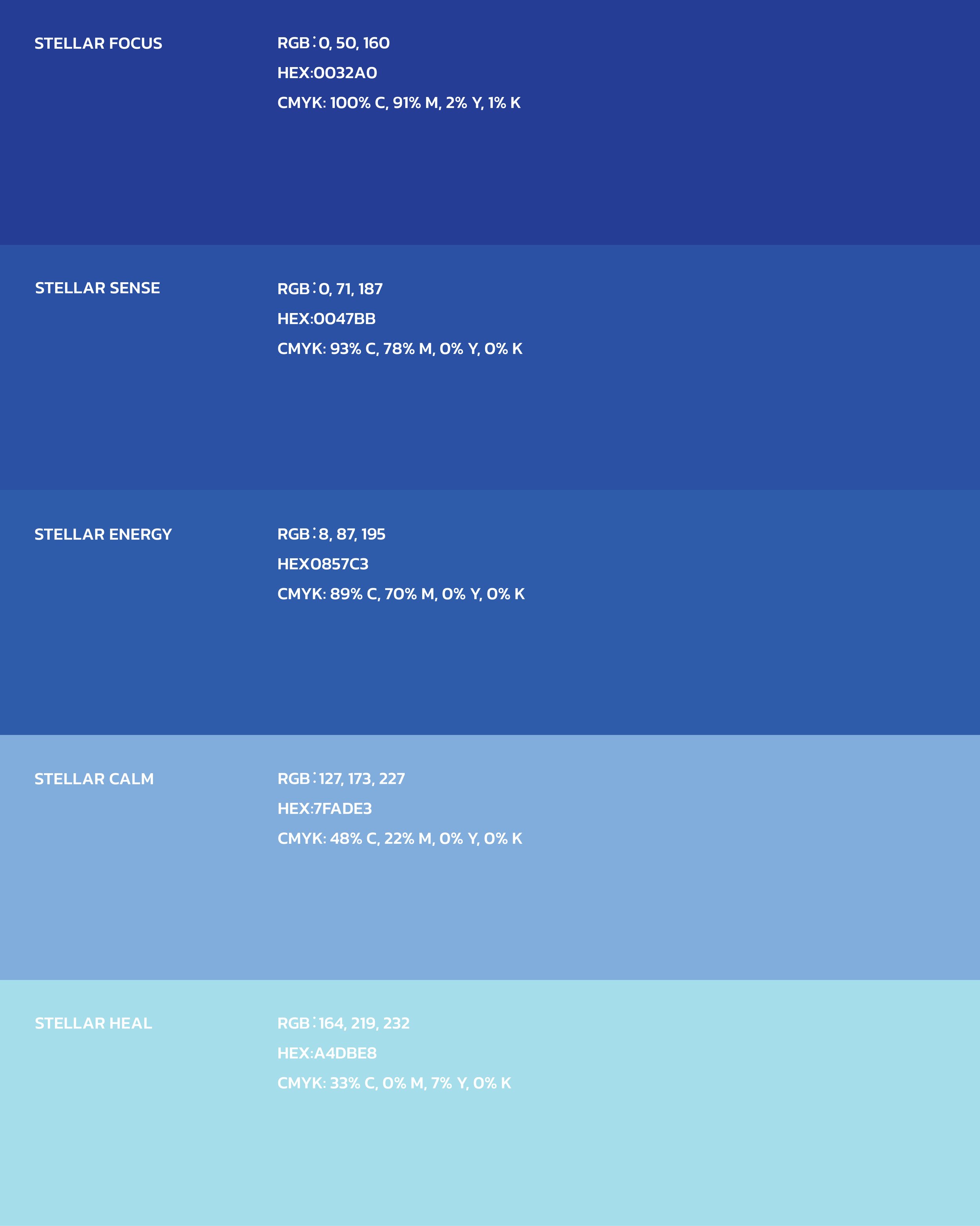
The color system reflects the brand’s two product lines: daytime and nighttime formulas. Warm colors represent the daytime products, inspired by sunlight and energy. Cooler blues represent the nighttime line, referencing the calm feeling of the night sky. The palette also connects to the brand’s inspiration from space and the Himalayas. These colors help clearly separate the two product lines and are used throughout the packaging and product design.
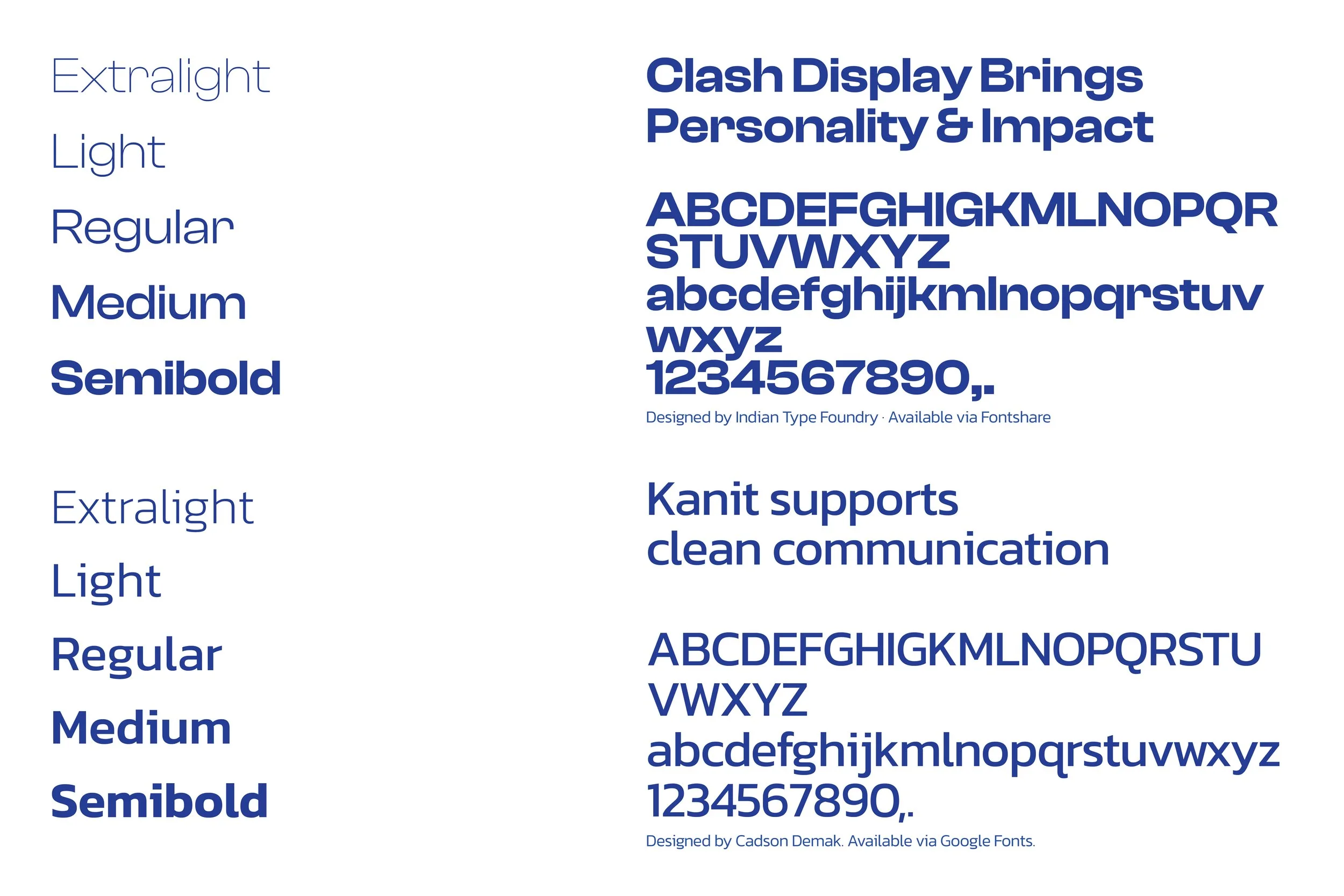
The typography was selected based on two main considerations: it needed to be commercially free to use, and it needed to match the brand’s modern and stylish tone.
Clash Display is used to bring personality to the brand, mainly appearing on product names and key titles on the packaging. Its bold and expressive style helps the brand feel more energetic and recognizable. Kanit is used for product details and information. Its clean and highly readable design helps present specifications and ingredients clearly, making the information easy to read on the packaging.